Creating the Titles for “The Mysterious Benedict Society”
How Penny Nederlander and Shine combined 2D and 3D to get just the right look.
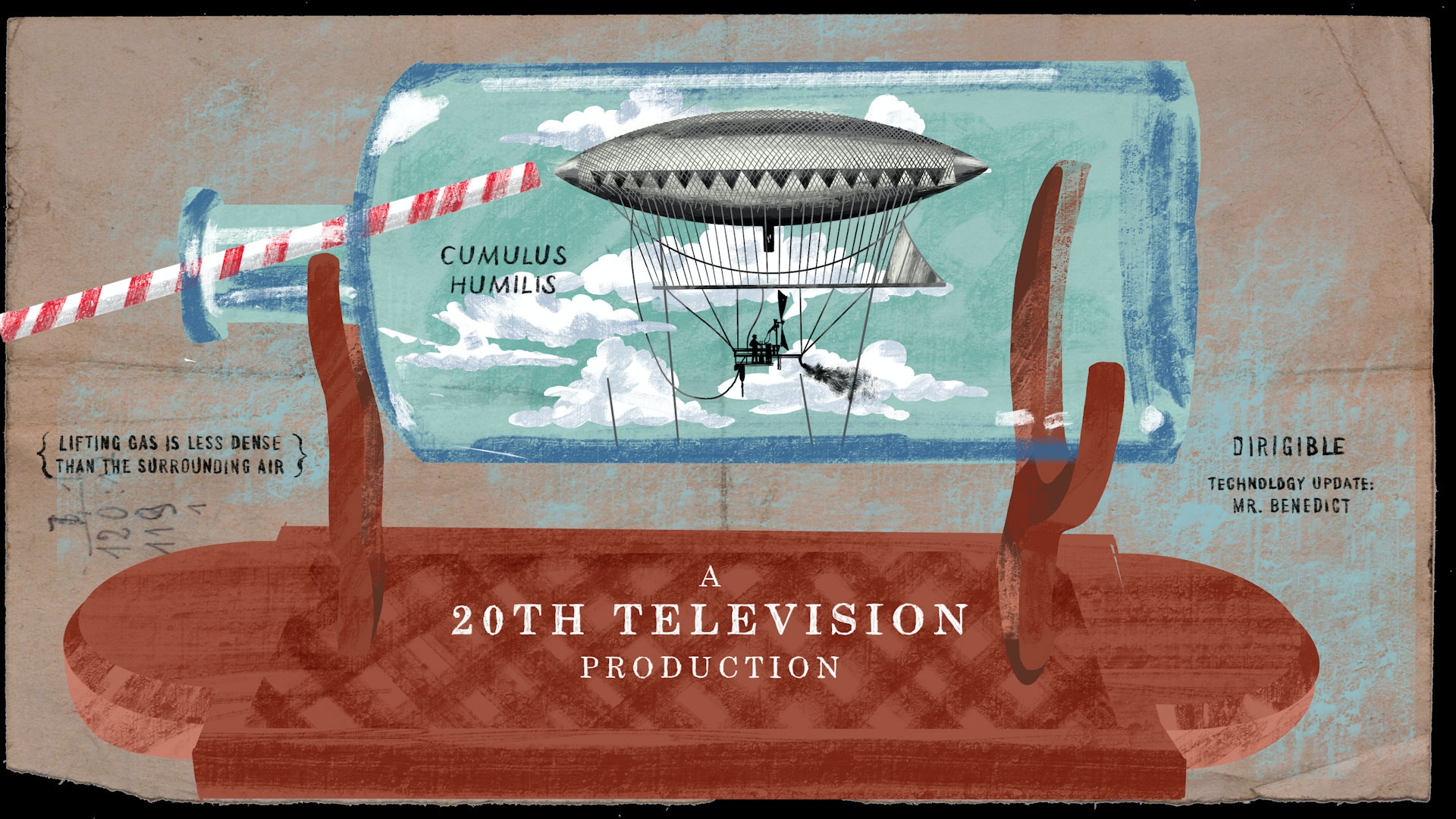
Based on the Trenton Lee Stewart children’s book series of the same name, season one of “The Mysterious Benedict Society” followed four clever orphans sent on a secret mission by Mr. Benedict, their strange benefactor played by Tony Hale.
Los Angeles-based Shine used Cinema 4D, Redshift and other tools to design, illustrate and animate the main title sequence for the popular series, and they’re already at work on the titles for season two.
Emmy Award-nominated Penny Nederlander, who has contributed to many high-profile title sequences, including “Temple Grandin,” “Birds of Prey: The Fantabulous Emancipation of One Harley Quinn” and “Kung Fu Panda,” has been working with Shine on the titles. We talked with the talented motion and VFX artist about her experience creating the enchanting titles, which hint at what’s to come in the series.
How long have you been working with Shine?

Nederlander: I’ve worked with Shine on and off since 2005, but for the last two years I’ve been freelancing with them consistently.
A couple of years ago, I was doing a lot of event work, hemispherical projection stuff and booth graphics. But all of that got wiped out because of the pandemic, so I hit up Shine and have been working on various title sequences ever since.
Your work often has a hand-drawn sketchy kind of look. Tell us about that.
Nederlander: I think of myself as a generalist, and it’s entirely possible that I’ve gone from being about 50 percent After Effects and 50 percent Cinema 4D to much more Cinema 4D in the past few years. It takes more time to work in a 2D fashion, and the speed of computers for 3D has made that much more useful to me.
I’ve been a fan of C4D’s Sketch and Toon for a long time, so I often use that, but I also draw in Photoshop and Procreate. Then, I match my drawing with lines in After Effects to try to make it all work together. The first time I tried to combine 3D and 2D to look flat and hand-drawn was for the “Temple Grandin” titles.
© PENELOPE NEDERLANDER / SHINE STUDIO
I did the same kind of thing with “Birds of Prey” and the Benedict sequences. As long as I keep my lines, like my brush is in Procreate and my line render is in Sketch and Toon, I can really do some fun things where people think they know how I’ve done something. But then I break that idea.
What kind of direction did you start with for the Benedict titles?
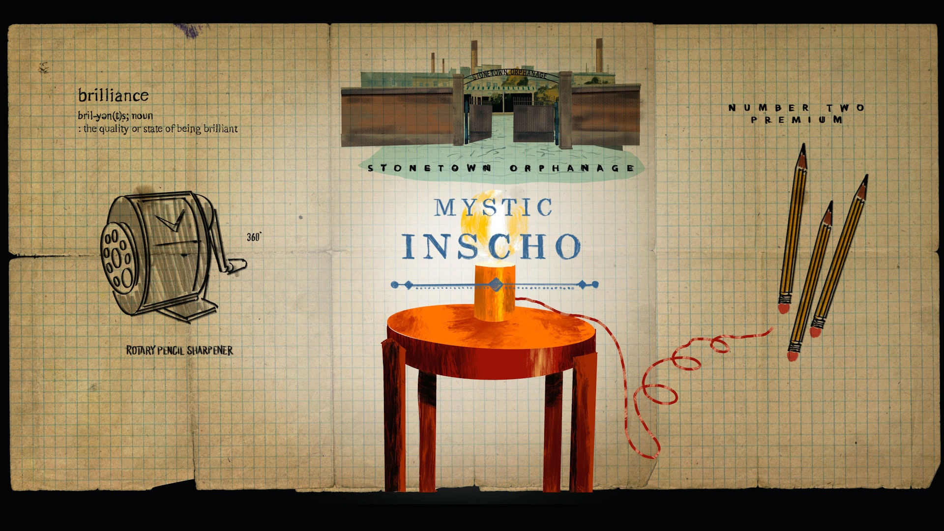
Nederlander: Michael Riley, the creative director, did the boards and I wasn’t involved in all of his process. He explained to me that there were a lot of elements per character, like Benedict has an electric car. Those elements were often physical manifestations of quirky things about each person, and Disney wanted the title cards to express that.
Michael and I have been working together for so long, we have a lot of shorthand and trust between us. Sometimes, he shows me the boards and asks what I think. Often, he’s thinking big picture and doesn’t get into the animation, but the boards have all these little elements that he draws in Procreate.
For “The Mysterious Benedict Society,” he wanted the elements to feel alive and do things. I wanted to make sure there was a way to make the eye travel around because there’s so much going on, it’s easy to miss things we don’t want people to miss.
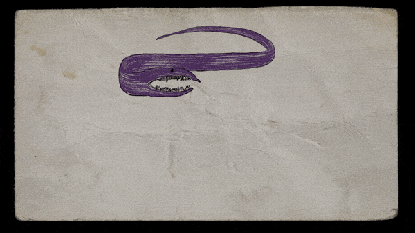
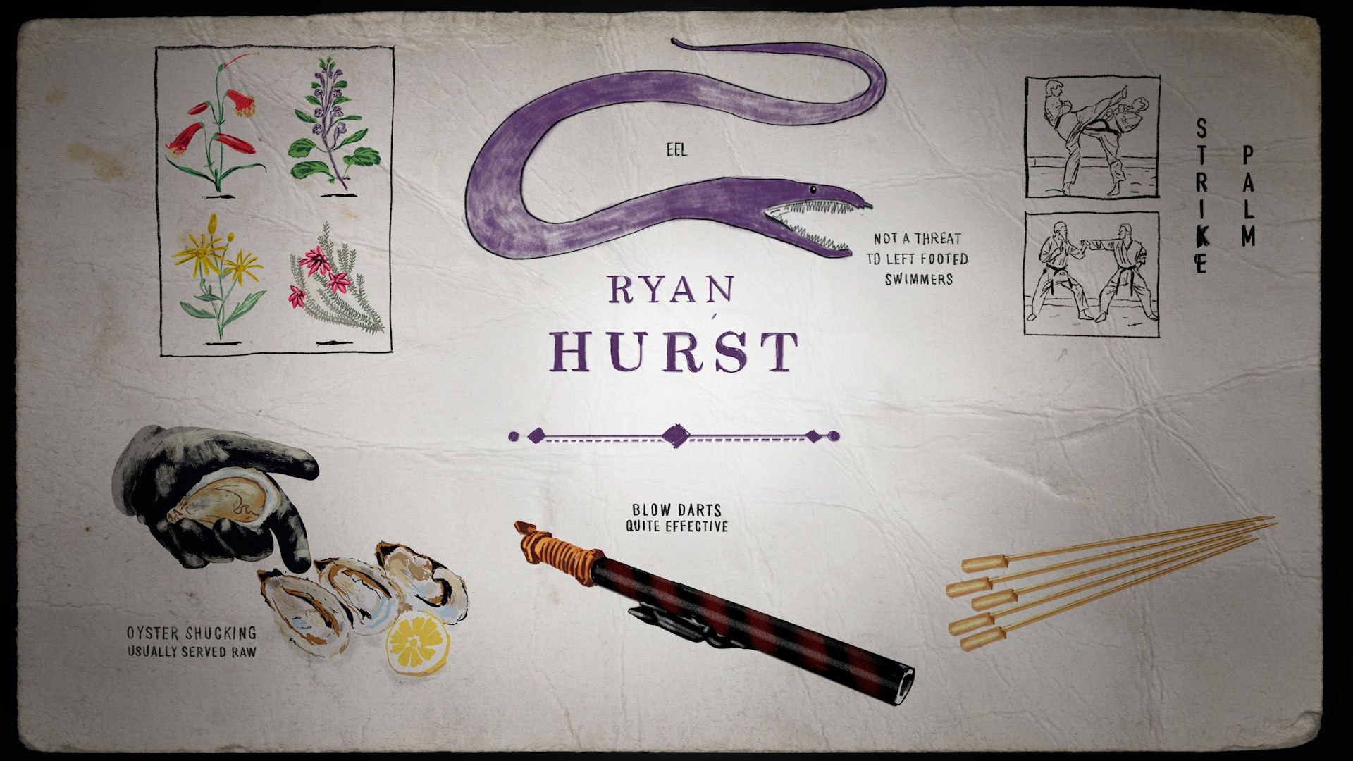
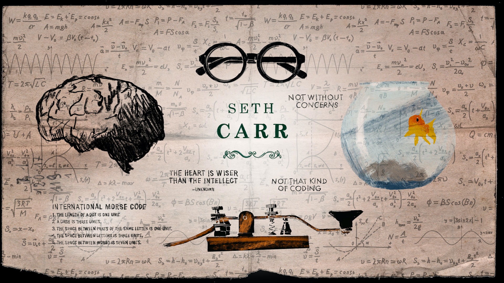
A good example is this moment where the darts on one of the pages separate and a blow gun nearby moves down and shoots the dart. Your eye is traveling so you see that an eel comes down next and there are always small things moving. The whole thing has the feel of a living sketch, and a lot of that was left up to me to figure out, which was fun. My favorite element in the titles is the eel. I love it because it looks so janky. It’s clearly 3D but it almost looks too childish to be 3D.
© PENELOPE NEDERLANDER / SHINE STUDIO
How do you think about what to make 2D or 3D?
Nederlander: The first thing I always try to figure out is how much I can cheat. I’m serious. A lot of 3D is really high-end, complex stuff and you have to do things the right way. You can’t fake realistic character animation, so you have to know so many things. I am not technical enough for a lot of that stuff, so I want to see how much I can do in 2D in After Effects.
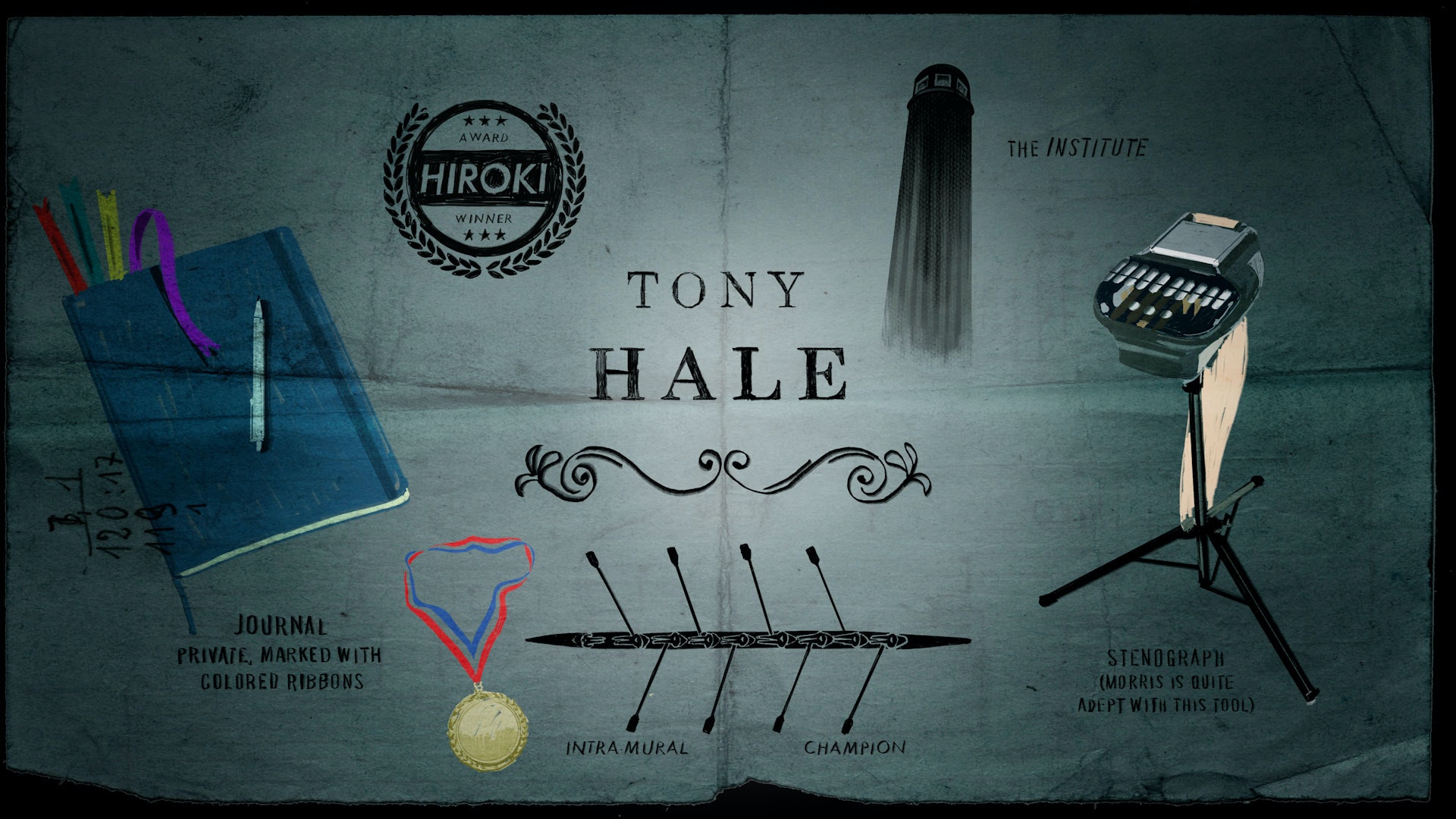
If it has to have a cel animation look, I always think, but does it actually have to be cel? If that makes sense, fine. But that’s not always the case. For example, for this project there is as a stenograph on one of Tony Hale’s title cards, and I wasn’t going to make that in 3D. I took that shape and tilted the top on the stand in After Effects and knew it would pretend to be 3D as long as the paper wagged with a delay.
© PENELOPE NEDERLANDER / SHINE STUDIO
© PENELOPE NEDERLANDER / SHINE STUDIO
The goldfish is another one of my favorite elements. I wanted it to swim around. I think it is the most complex shape in the entire thing, so I wanted it to look illustrated. I created a simple goldfish with a gradient shader. It was very flat, and I gave it a lot of bend deformers on the fins and had it move along a path with a spline wrap in Cinema, so the body deformed.
I experimented with putting drawn textures on it, but that didn’t feel right, so I used the Video Gogh plugin in After Effects. The water and rays are Procreate and the fishbowl itself has a turbulent distortion on top of it so it wiggles, giving the effect of looking through water. It took like half a day to put together, and that’s the most complex thing in the entire sequence.
© PENELOPE NEDERLANDER / SHINE STUDIO
If I can get away with movement in 2D, I will do that. But I couldn’t do that with the pencil sharpener on one of the title cards. It’s shown from a three-quarter angle with a crank rotating on a tilted angle, so I built it to be a 3D element, and then messed it up to make it look exaggerated and wavy in places. It feels drawn, but it’s still the most obvious 3D element to me.
What sorts of things are important to know when creating title sequences?
Nederlander: With title sequences, readability, type size and time on screen are half of what you need to pay attention to. Those don’t seem like very artistic things but they’re all part of the job and make a big difference.
© PENELOPE NEDERLANDER / SHINE STUDIO
All of the cuts with this are about the same length, and there are a lot of things that feel simple. But I can watch this sequence over and over and always look at a different place and see something I haven’t noticed before. There are all of these little storytelling aspects, and they’re all part of building the story. Like, the second Tony Hale card falls off into the blackness for a reason. Those clever moments, for me, make every second fun to watch.
I’m not one of those people who can’t watch a movie without picking apart the VFX. I might think some effect is really impressive but, for the most part, I’m just interested in the fun and storytelling. There’s my job, and then there’s life. I thought this project was really fun to work on, and I hope people like it.
Author
Meleah MaynardWriter/Editor – Minneapolis, Minnesota